
More conversions, less churn: redesigning mobile onboarding for Joom

As UX writers, we design copy that attracts users to our digital product and keeps them coming back for more. This begins with a crucial touchpoint: a smooth onboarding flow.
In this post, we’ll explore how to improve the user onboarding experience on a popular mobile e-commerce app that sells a wide range of consumer goods. This includes refining the product’s language but also goes beyond the words.
With over 400 million users worldwide, Joom competes with retail giants like Temu, SHEIN and Wish.
We’ll analyze the initial onboarding screens and evaluate the offers and features presented before reaching the store page.
This is sort of a blind exercise. I implement as many improvements as possible based on the app experience and the store’s desktop site, without relying on other data such as business intelligence or user research.
Let’s get started!
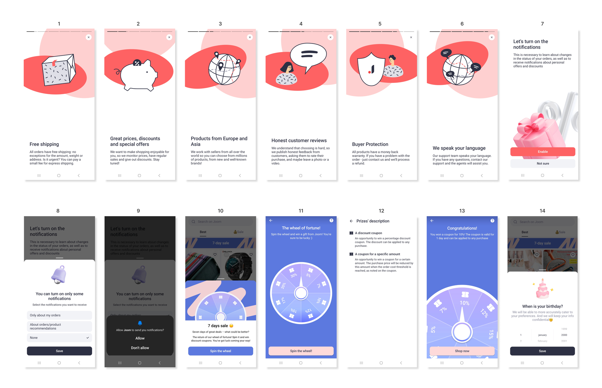
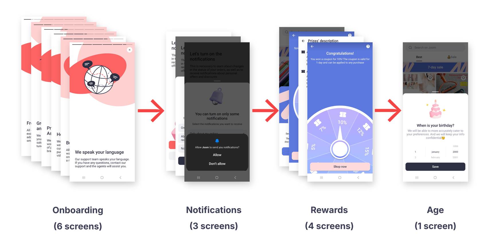
This is what the entire onboarding flow looks like.
Now, on to the meat.
An alternative to carousels
We’re greeted with a carousel, with each slide highlighting a specific feature or benefit.
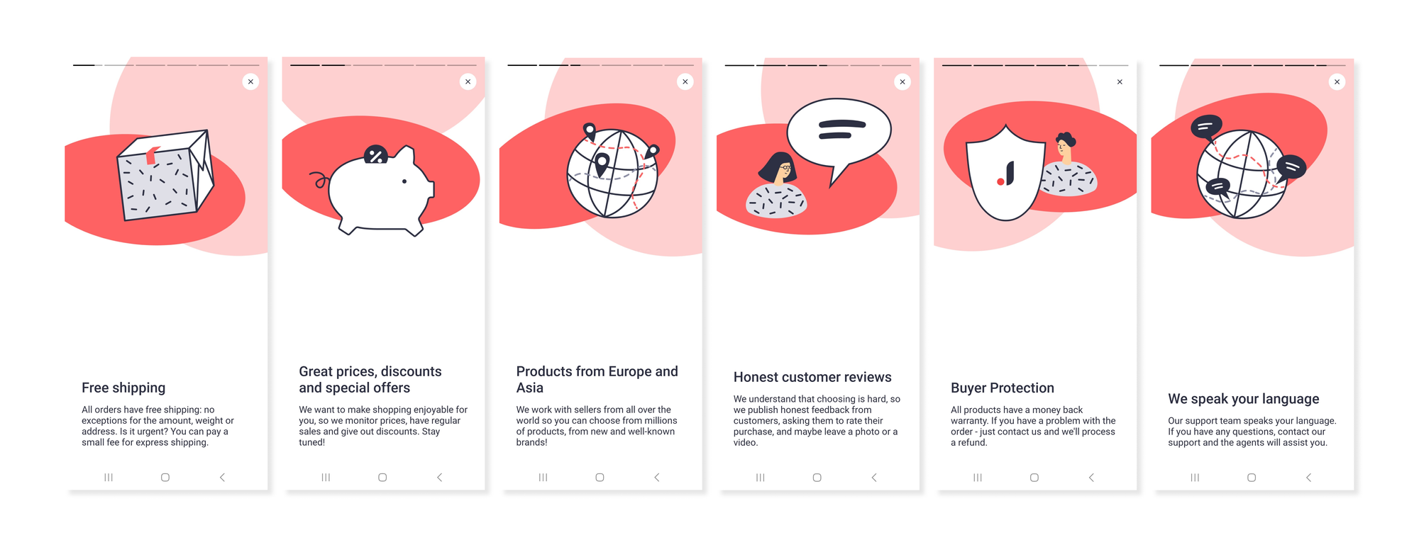
We’ll break them down one by one.
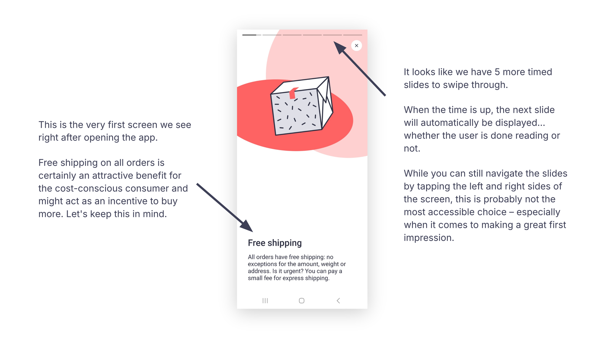
This is the very first screen we see after opening the app.
Free shipping on all orders is an attractive benefit for cost-conscious consumers and might encourage them to buy more. Let’s keep this in mind.
It seems there are five more timed slides to swipe through. When the timer runs out, the next slide loads automatically, whether the user is finished reading or not.
Although you can press the screen to pause the timer or navigate the slides by tapping the left or right sides, this approach isn’t the most accessible for creating a strong first impression.
We also have the option to skip the slideshow altogether.
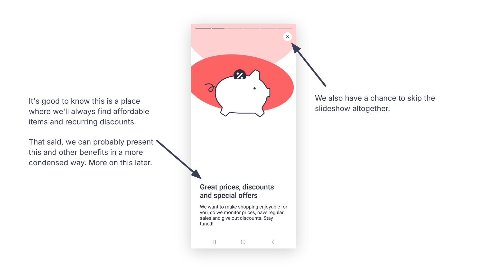
It’s reassuring to know we can always find affordable items and recurring discounts here.
Anyway, these and other benefits could likely be presented more concisely. More on this later.
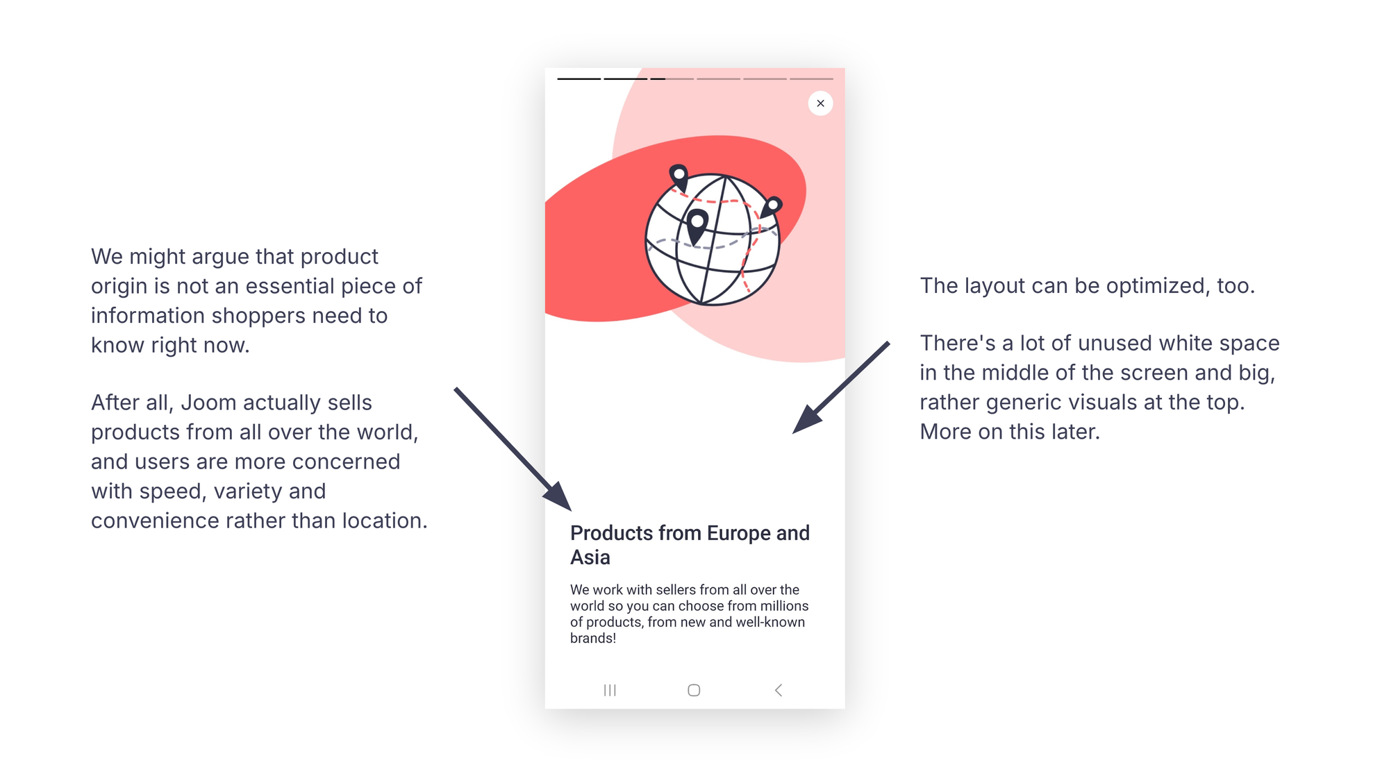
We could argue that product origin isn’t essential information for shoppers at this stage.
The company sells products worldwide and its target users are generally more focused on speed, variety and convenience than location.
The layout could also use some optimization, too. There’s a lot of unused white space in the middle of the screen and large, somewhat generic visuals at the top. We’ll come back to this.
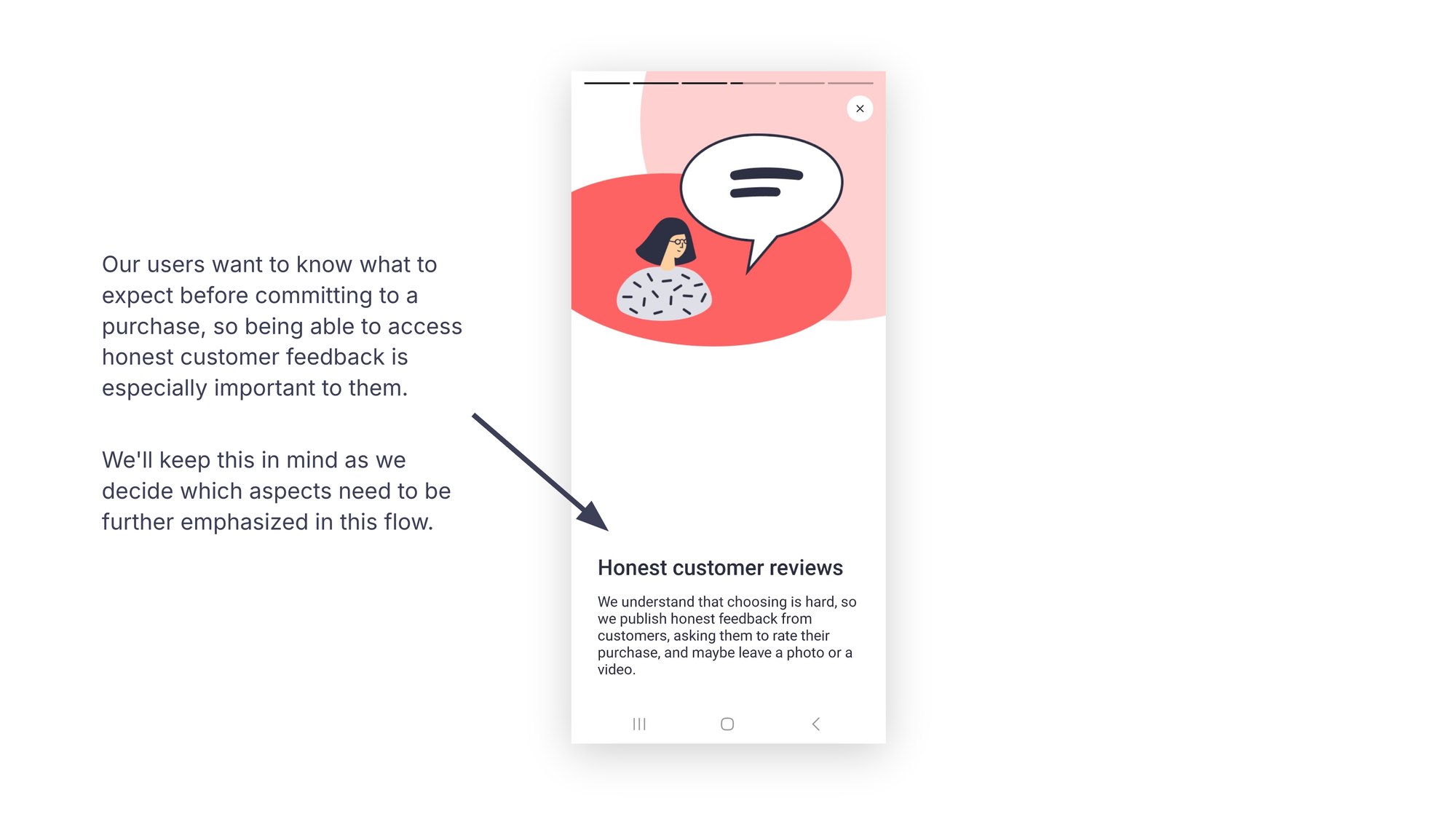
Users want to know what to expect before making a purchase, so access to actual customer feedback is especially important to them.
We’ll keep this in mind as we determine which aspects to emphasize further in this flow.
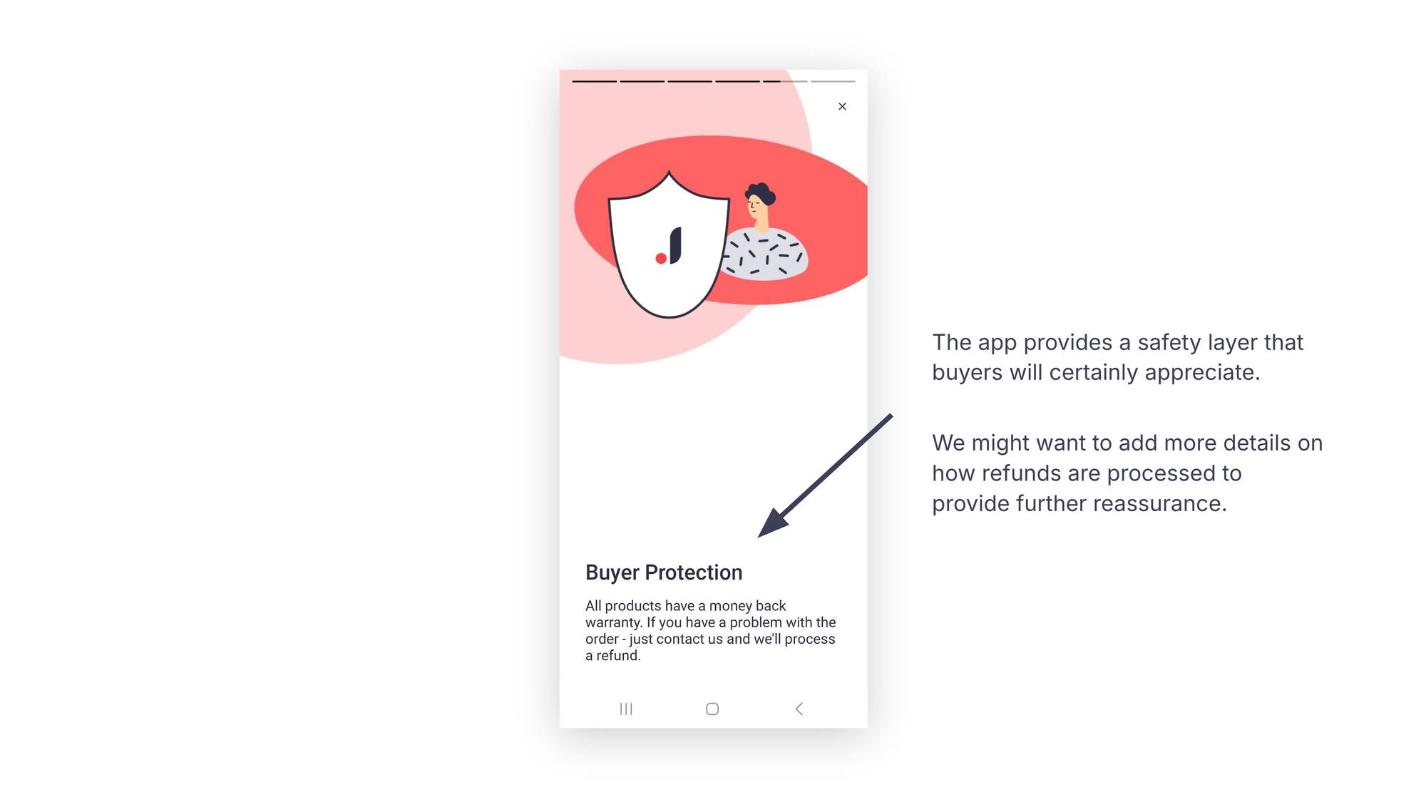
Providing a safety layer is a benefit buyers highly value.
Including more details about the refund process could offer extra reassurance.
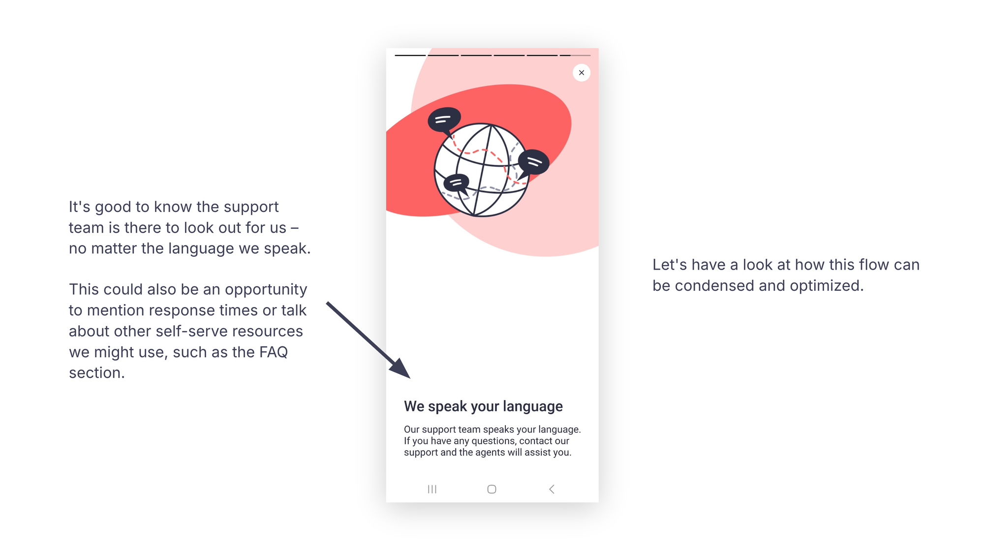
This is the final timed onboarding screen.
It’s helpful to know the support team is there for us, no matter which language we speak.
This could also be a chance to highlight response times or mention other self-serve resources, like the FAQ section.
Let’s see how to condense and optimize this flow. We’ll focus on these aspects:
- Highlight the key points to convey: convenience, variety, free shipping, customer reviews, money-back guarantee and customer support
- Streamline the message: reduce it from six to two screens, cut points from six to five and shorten explanations
- Prioritize benefits over features
- Engage the reader with action verbs and questions
- Maintain a conversational, friendly and informative tone
With a clear idea of the information to include and how to organize it, I can now sketch a revised layout for this part of the flow.
Here’s what the new layout might look like:
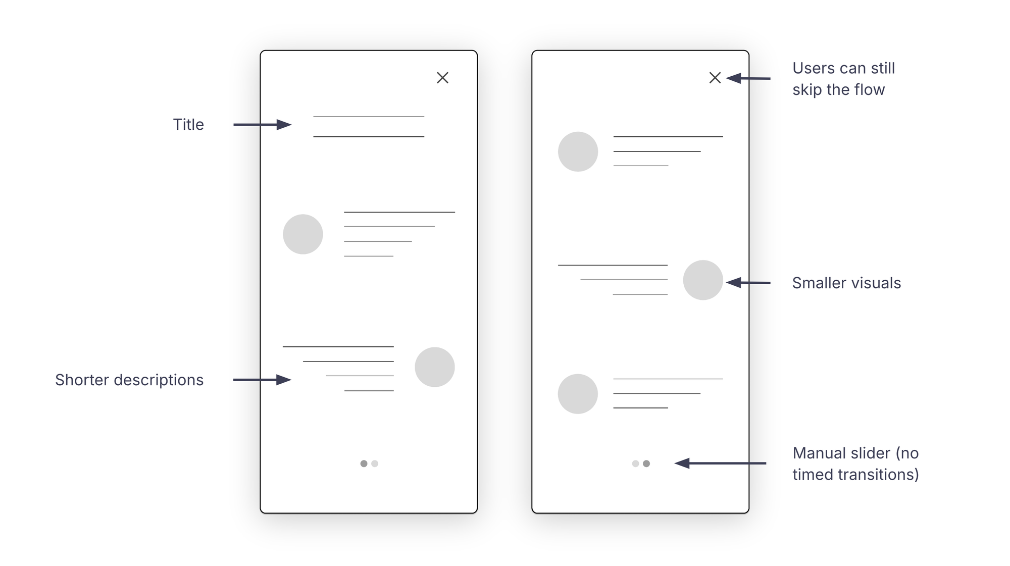
This streamlined layout features a title at the top of the first screen, shorter descriptions and smaller visuals.
We’ve reduced the flow from six screens to two. Users can navigate between the two screens using a manual slider or skip this part entirely.
Now, let’s take a closer look at the copy:

Since this is the first time users open the app, we can offer more context at the top of the first screen. For example, we could include the brand name (or logo) and a concise tagline. I’ve used the brand’s official tagline here; ideally, it should briefly summarize the benefits we’re about to cover.
For the first point, I’ve emphasized item variety and rewards, which are central to the product and can quickly build interest, engagement and brand loyalty.
Free shipping is another strong selling point for this brand. While this order works in this example, we might consider switching the first two points depending on factors like business priorities or insights from user research.
While keeping our tone conversational, friendly and informative, we can also be a bit more cheerful when delivering good news, as we do here.
Next, we address potential customer questions upfront (e.g., "Can I trust this seller?" or "How does this product actually look?"). Highlighting product reviews and user-generated content can help build trust and enhance the platform’s credibility.
Other objections might relate to late deliveries or missing and damaged items. At this point, we offer reassurance and explain what will happen if an order goes wrong.
Finally, we keep the conversation open by outlining the available customer support options.
This is one possible approach to condensing and optimizing this part of the flow. Depending on the brand’s needs and the users, there are many ways to reorganize the interface and present the copy. As mentioned, the more information we can gather, the more we can tailor the design process.
Managing notifications with tact

Next, we’re prompted to manage our notifications. Let’s see how the app handles this process.
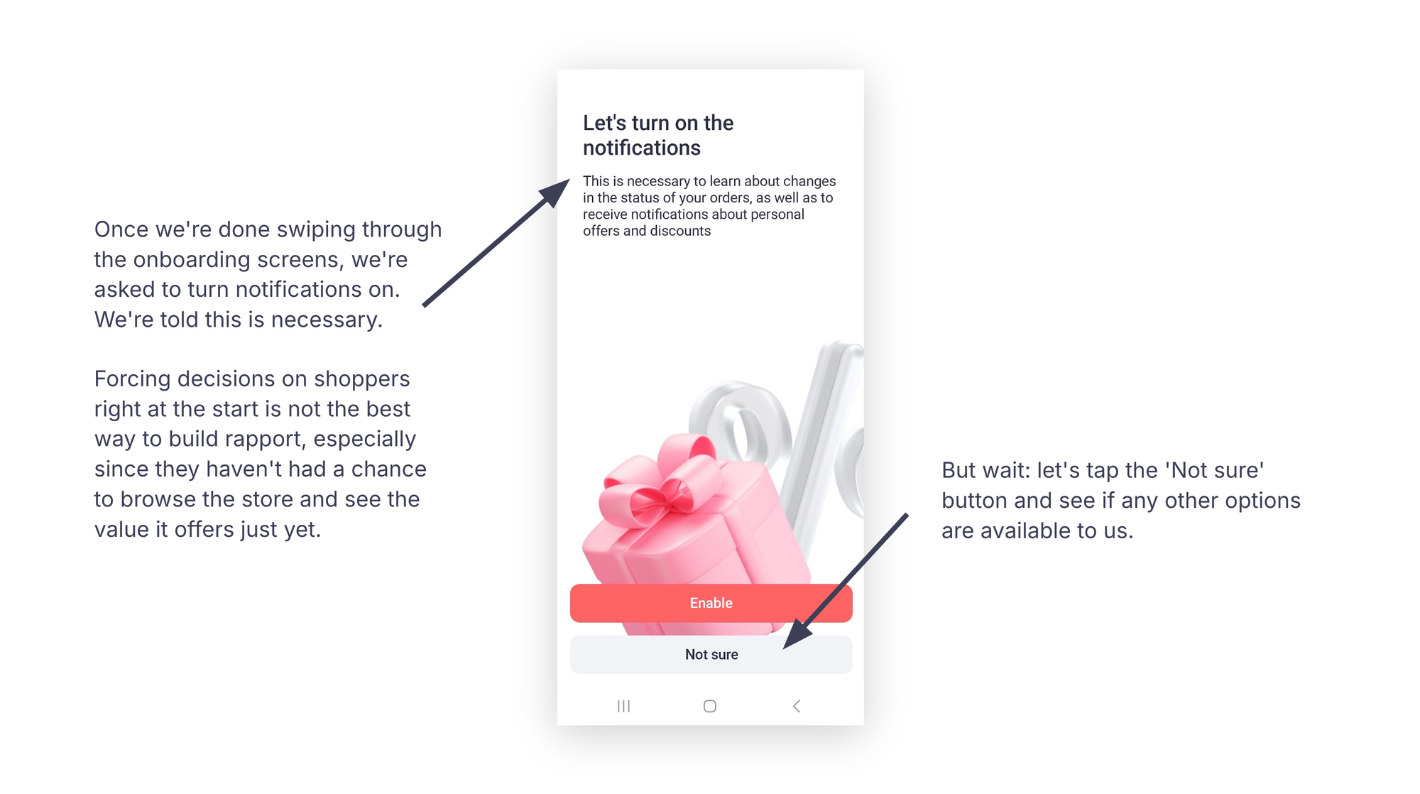
Once we’ve finished swiping through the onboarding slides, we’re asked to turn notifications on, with a message stating that it’s necessary.
Forcing decisions on shoppers right at the start isn’t the best way to build rapport, especially when they haven’t had a chance to browse the store and see the value it offers.
Let’s tap "Not sure" and check if other options are available.
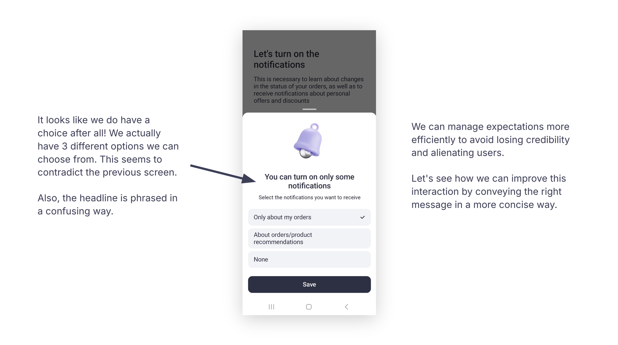
It looks like we do have a choice, after all! There are actually three different options to choose from. This seems to contradict the previous screen.
Also, the headline is phrased in a confusing way.
We can manage expectations more effectively to avoid losing credibility and alienating users.
Let’s improve this interaction and deliver the right message more concisely.
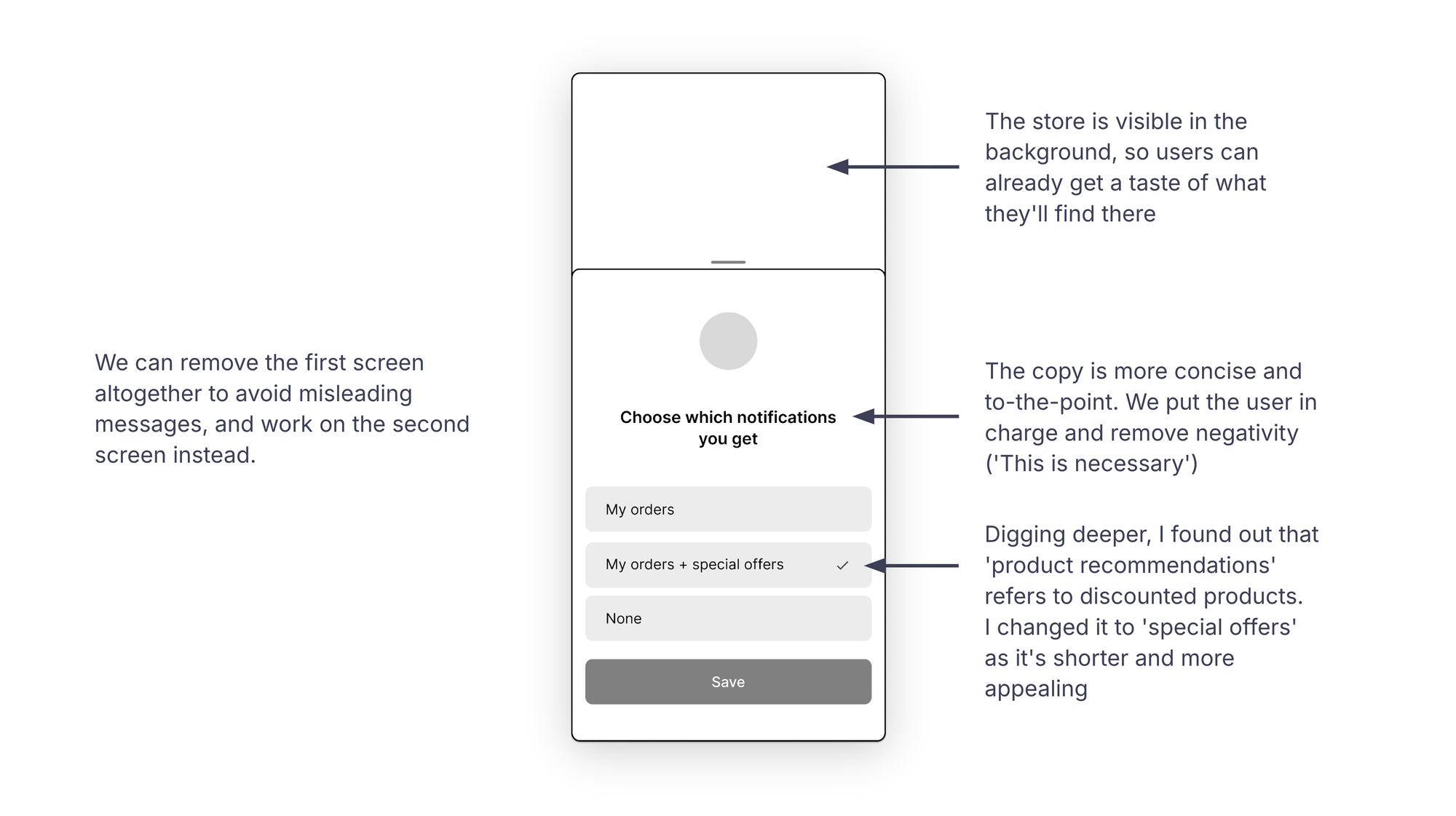
To avoid sending misleading messages, we can remove the first screen entirely and focus on improving the second screen instead.
The copy in this proposal is more concise and direct. We give users control over their preferences and remove the sense of urgency ("This is necessary").
Upon further review, I found that "product recommendations" refer to discounted products, so I changed it to "special offers" for brevity and appeal.
Additionally, the store is already visible in the background, giving users a sneak peek of what they’ll find once they’re in.
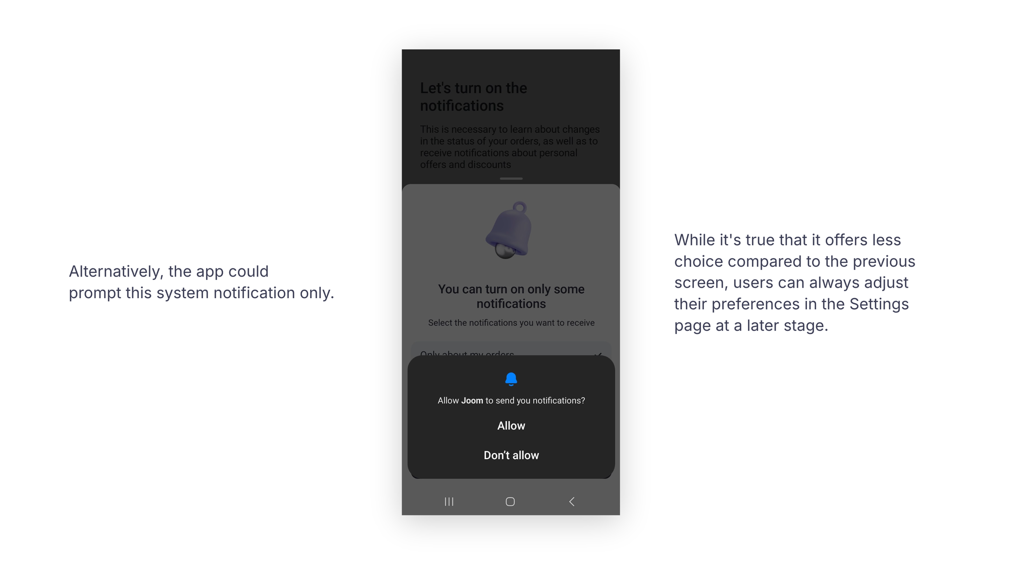
Alternatively, we could go straight to this push notification message for a shorter, cleaner flow.
While this solution offers fewer options than the previous screen, users can always adjust their preferences later on the Settings page.
Adding incentives with clear rewards
It’s time for a little incentive to start shopping right away! Let’s see what the app has in store for us.
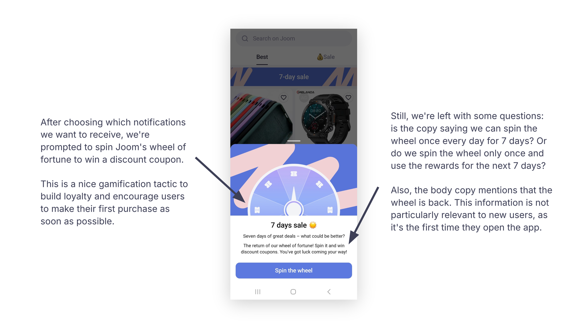
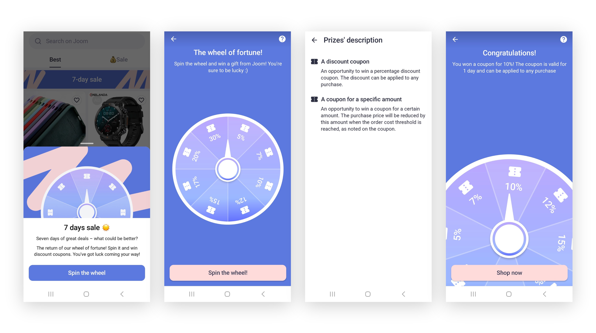
After selecting which notifications we want to receive, we’re prompted to spin the wheel of fortune for a discount coupon.
This is a common gamification tactic to build loyalty and encourage users to make their first purchase quickly.
Still, we’re left with questions. Does the copy suggest we spin the wheel once a day for seven days? Or do we spin the wheel just once and use the rewards for the next seven days?
Also, the body copy mentions that the wheel is back. This isn’t particularly relevant to new users, as this is their first time opening the app.
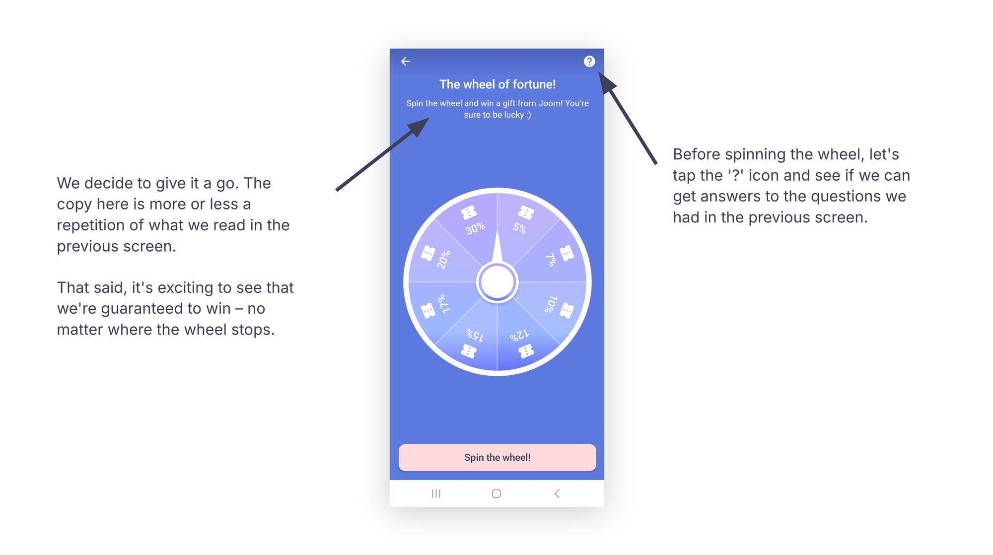
We decide to give it a try. The copy here largely repeats what we saw on the previous screen, but it’s exciting to know that we’re guaranteed to win — no matter where the wheel stops.
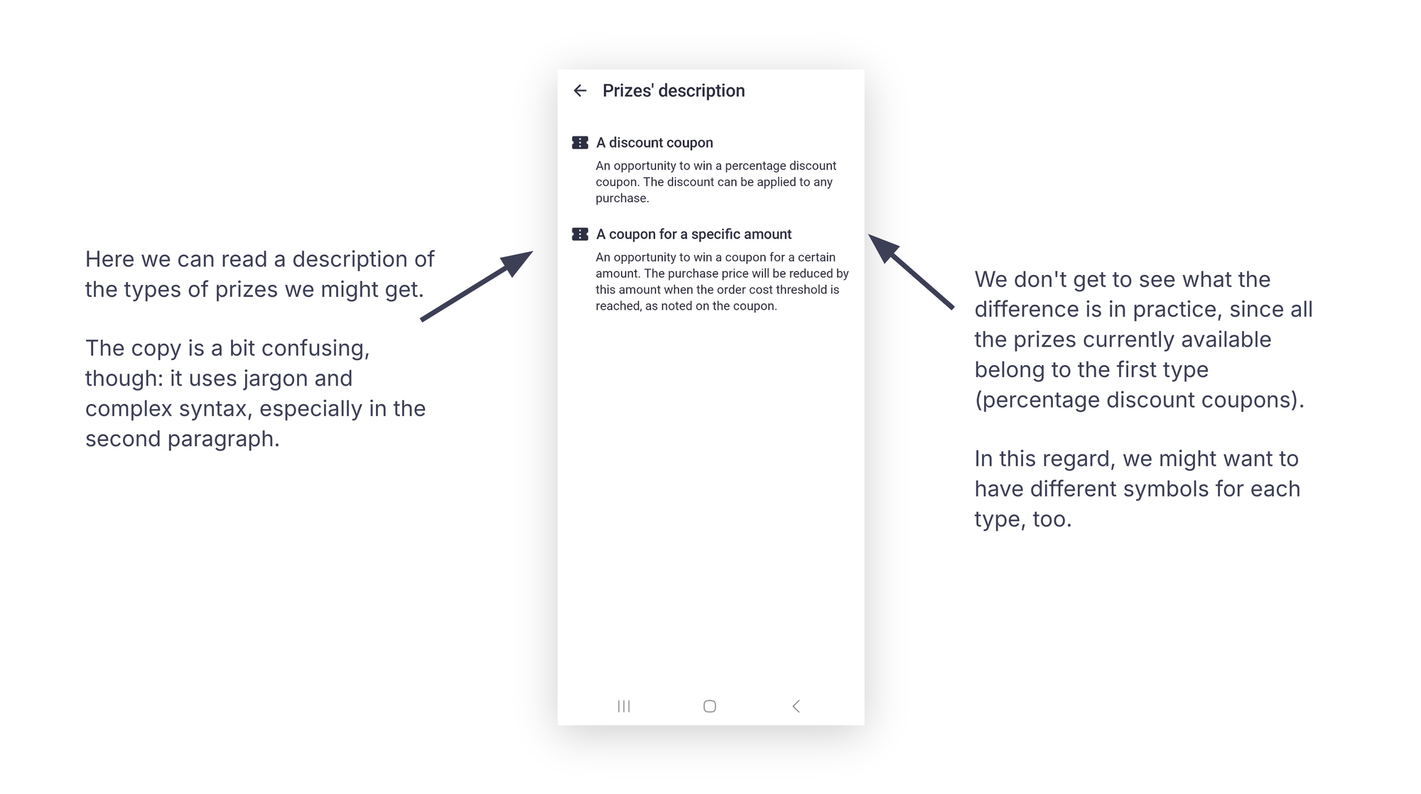
Tapping the question mark symbol shows a description of the types of prizes we might receive.
The copy is a bit confusing, with jargon and complex syntax, especially in the second paragraph.
We don’t get to see the practical difference between the types, as all the prizes currently available are from the first category (percentage discount coupons).
In this case, using different symbols for each prize type might be helpful.
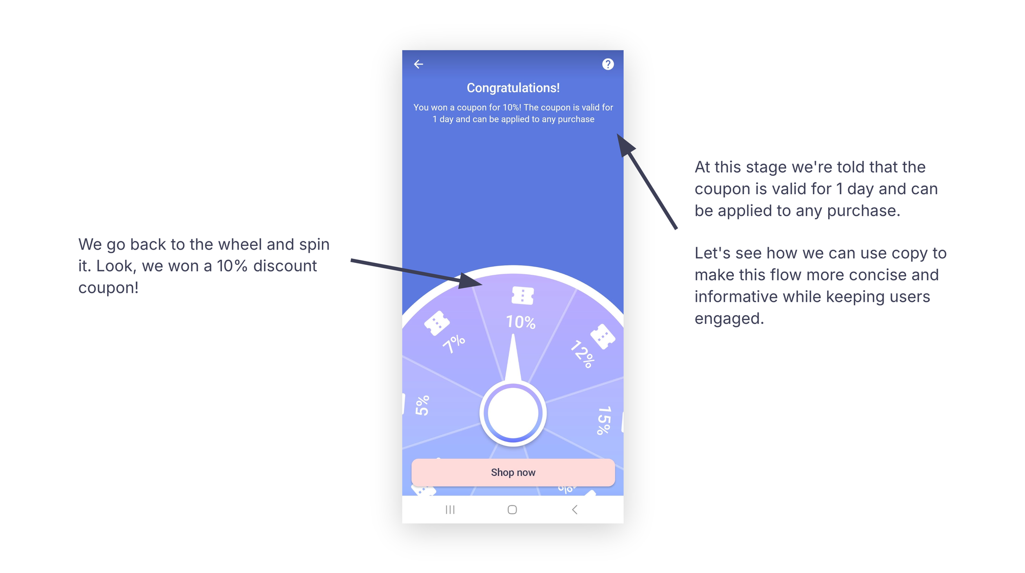
We go back to the wheel and spin it. Look, we won a 10% discount coupon!
At this point, we’re told that the coupon is valid for one day on any purchase.
Let’s see how we can use copy to make this flow more concise and informative while keeping users engaged.
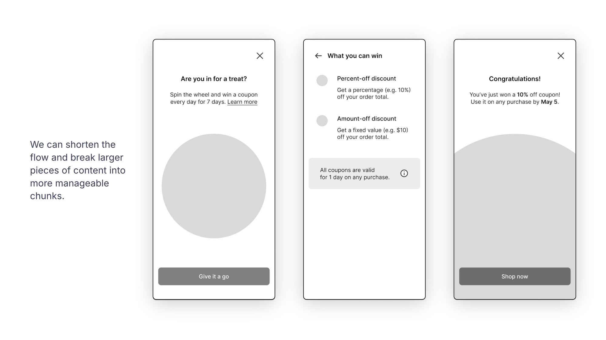
For starters, we can shorten the flow and break larger content into more manageable chunks.
Now, let’s take a closer look at each screen.
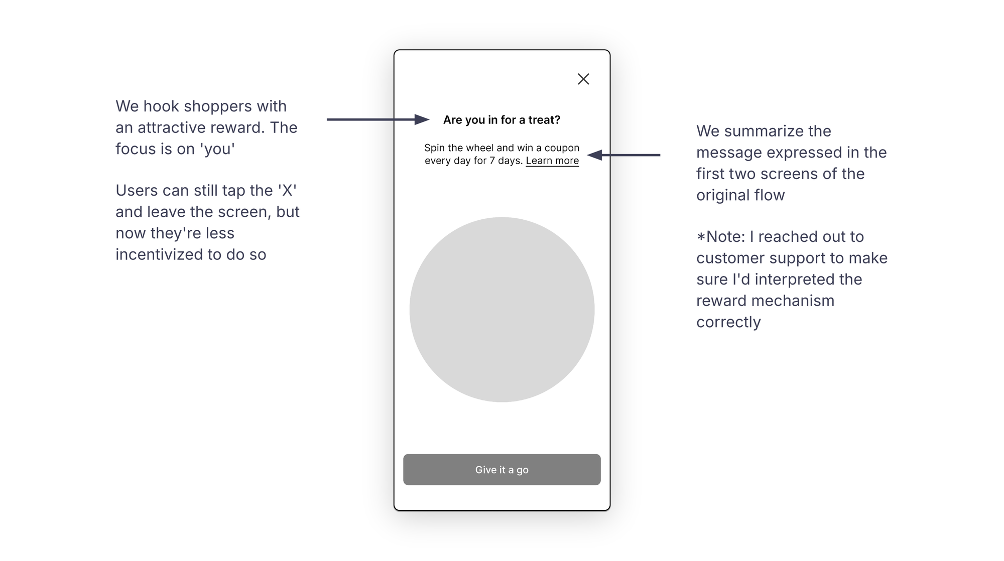
We hook shoppers with an attractive reward. The focus is on them.
Users can still tap the Close icon and leave the screen, but they might be less inclined to do so with the prospect of a reward.
We’ve summarized the message from the first two screens of the original flow.
I reached out to customer support within the app to confirm that I’d interpreted the reward mechanism correctly.
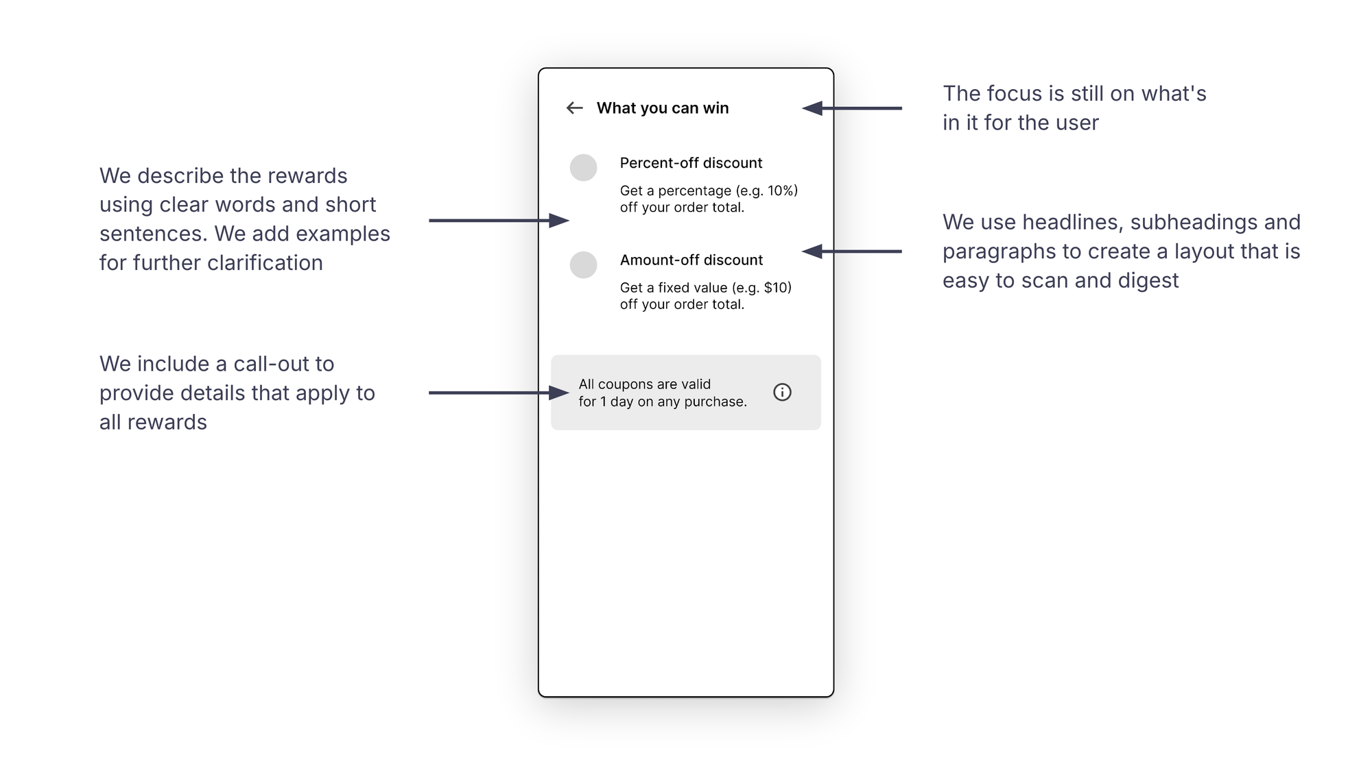
The title still focuses on what’s in it for users.
We describe the rewards with clear language and short sentences, including examples for further clarification.
Headlines, subheadings, paragraphs and call-outs help create a layout that’s easy to scan and digest.
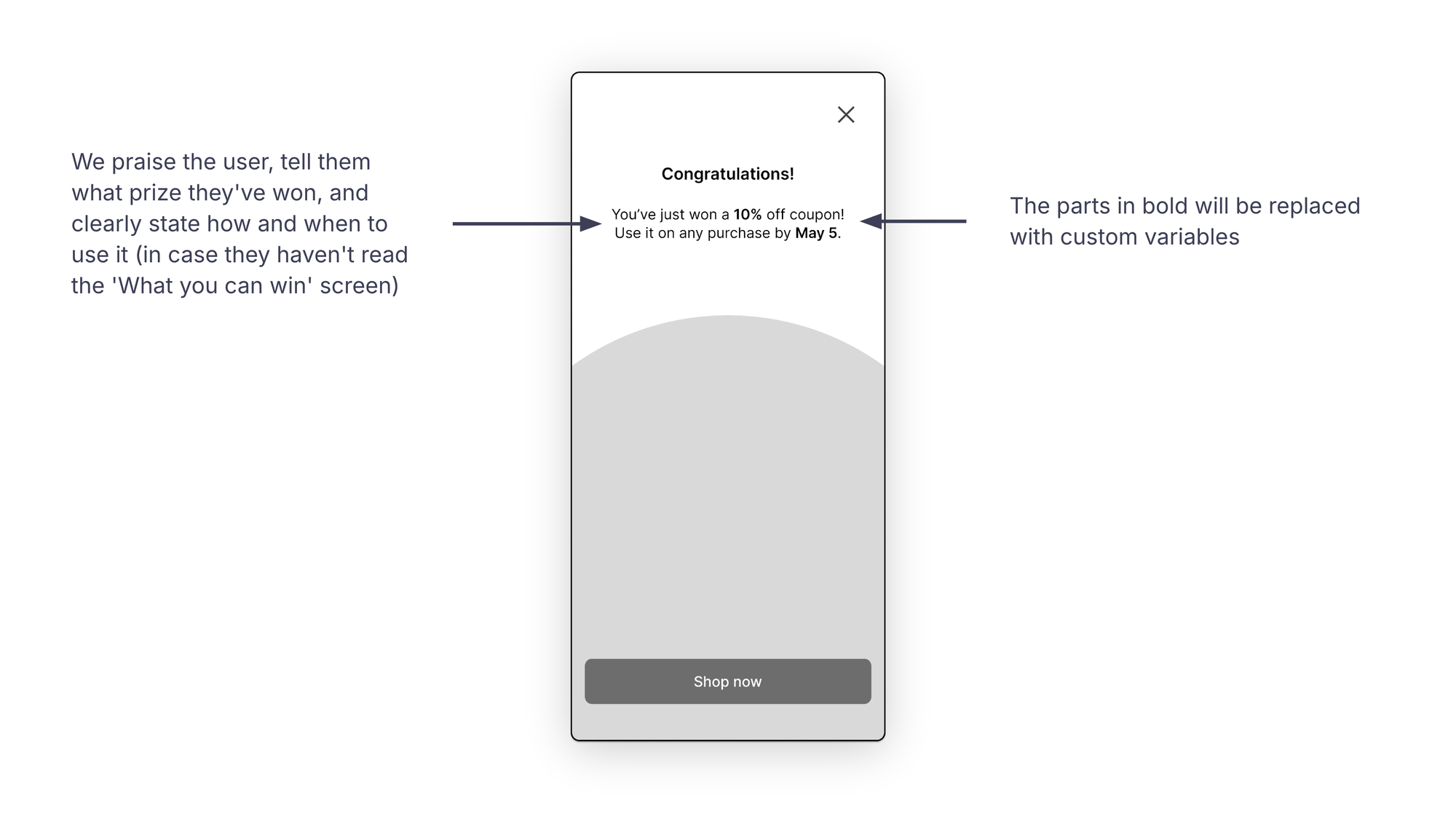
We congratulate the user, tell them what they’ve won and clearly explain how and when to use the prize.
If they haven’t read the "What you can win" screen, they’ll get a recap of key details here.
Personalizing the experience with the right questions
We’re almost there! Before we get to the actual store, this flow has one last question for us.
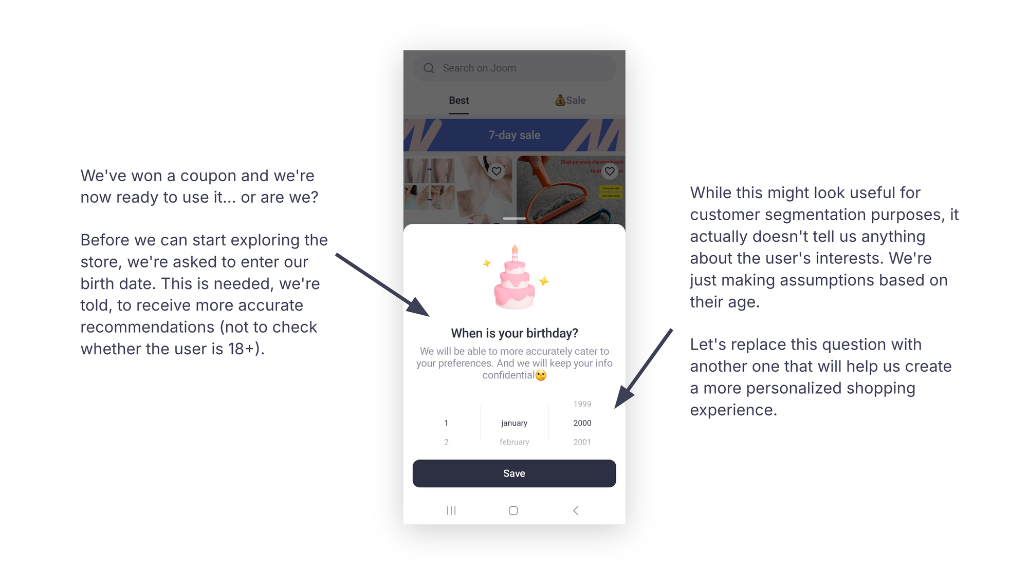
We’ve won a coupon and are ready to use it… Or are we?
Before we can start exploring the store, we’re asked to enter our birth date. We’re told this is needed to receive more accurate recommendations (and not to verify whether the user is 18+).
While this might seem useful for customer segmentation, it doesn’t provide insight into the user’s interests. We’re simply making assumptions based on their age.
Let’s replace this question with one that will help create a more personalized shopping experience.
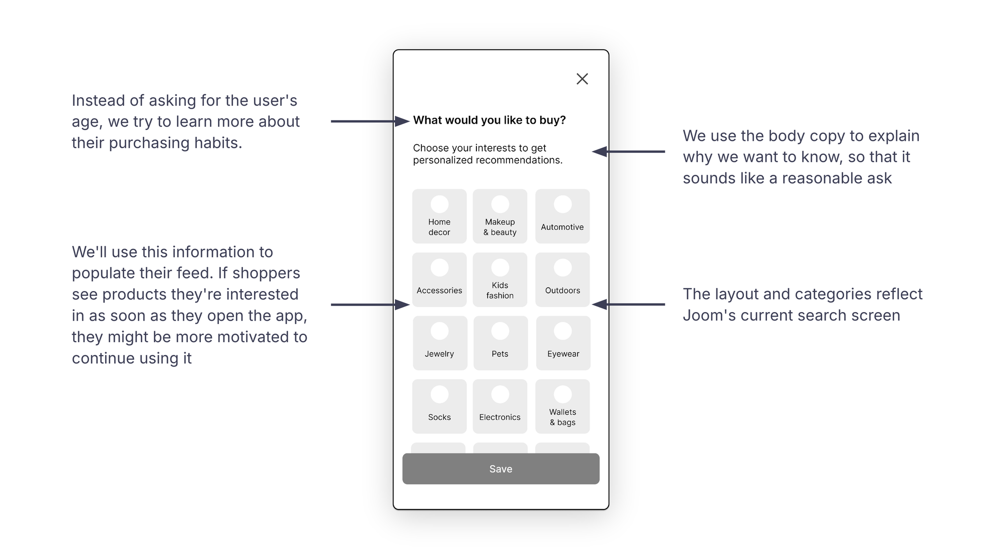
Instead of asking for the user’s age, we focus on learning more about their purchasing habits.
We then use the body copy to explain why we’re asking, making it feel more reasonable.
We’ll use this information to populate the user’s feed. If shoppers immediately see products they’re interested in, they might be more motivated to continue using the app.
Once the onboarding flow is complete, we can always ask users to specify their age in the settings if necessary.
Lastly, the layout and categories here mirror the app’s current search screen, so we stay aligned with existing assets and design choices.
Wrapping up
So far, we’ve seen that the current onboarding experience falls short for several reasons:
- It’s too long-winded
- It pressures users to turn on notifications before offering any tangible value
- There’s a lack of relevant personalization
- The copy is often repetitive or convoluted
- There’s no sign-in screen; users can only sign in after completing the onboarding flow in the Profile section
Here’s how we can improve the experience for both users and the business:
- A shorter, more concise flow: users are less likely to drop out
- Single-click sign-in with social media accounts: we collect user data without adding friction (possibly in exchange for additional rewards)
- Allowing users to manage notifications: non-intrusive, respectful requests help reduce customer churn
- Asking the right questions to profile users: tailor-made experiences boost engagement
- Clear, compelling copy that puts the user front and center: this should lead to higher adoption and retention rates
Here’s a quick glance at the current flow:
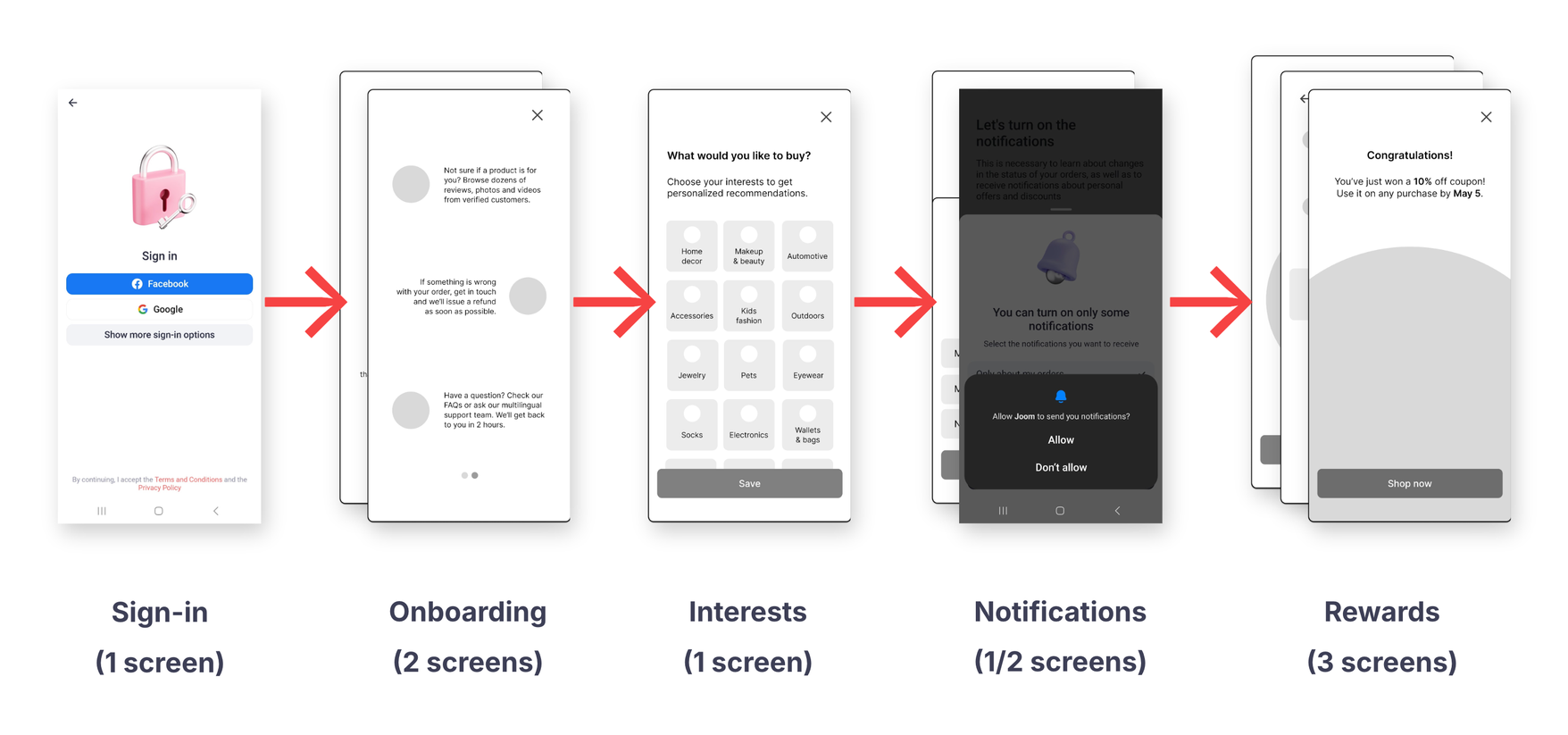
This is how the improved flow looks at a glance:
Well, that’s it! If you’re still here, thanks for sticking with me.
I hope you found this post helpful. Feel free to reach out and share your comments, questions and suggestions so we can learn from each other’s processes.
Let’s talk words
Get in touch on LinkedIn to talk about all things UX writing, content design and localization.
Contact me