Supporting an MVP launch with content
I was challenged to design a set of content guidelines to support the launch of a fictional digital product of my choice. Here's how I went about it.

The project
As part of a UX writing course, I researched and created content for a new digital product — including a user journey map, a content audit, writing guidelines and plenty of copy examples.
“Excellent work, Elisa. Your brand voice guide is neat and straightforward — perfect to support an MVP. You’ve also included plenty of examples of dos and don’ts.”
— Luca Longo (senior UX designer and mentor)
Role
Content designer
Language
Italian
Tools
Figma, Airtable
Timeline
2 months
The problem
I’ve been following the creator economy for several years now.
Content creators have gone from casual posters to full-time influencers with a busy publishing schedule and multiple income streams, including merch, paid communities, courses and books.
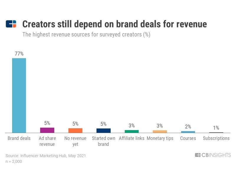
Many of them, though, still rely on brand deals to make a good living off their craft.

An idea
Several influencer networks already exist in Italy to help creators consistently find brand deals, but partnerships come with a long list of requirements to meet.
Guild, an emerging Italian network, aims to fill the gap.
With Guild, creators can find brands on their own and for free on a dedicated platform, or switch to a paid plan to get training, financial advice and a whole team to help them plan and produce content.

Journey mapping
Conversation mining and creator-led podcasts helped me get a better understanding of the current landscape in Italy.
I started compiling the main needs, problems, fears and frustrations creators face in their daily work.
With this information, I created a journey map to document the steps creators go through when looking for a network.

Factors undermining the relationship:
- steep learning curve
- lack of information and guidance
- lack of transparency
- high commission
- scams

Content auditing

While studying creators, I also had a closer look at existing networks.
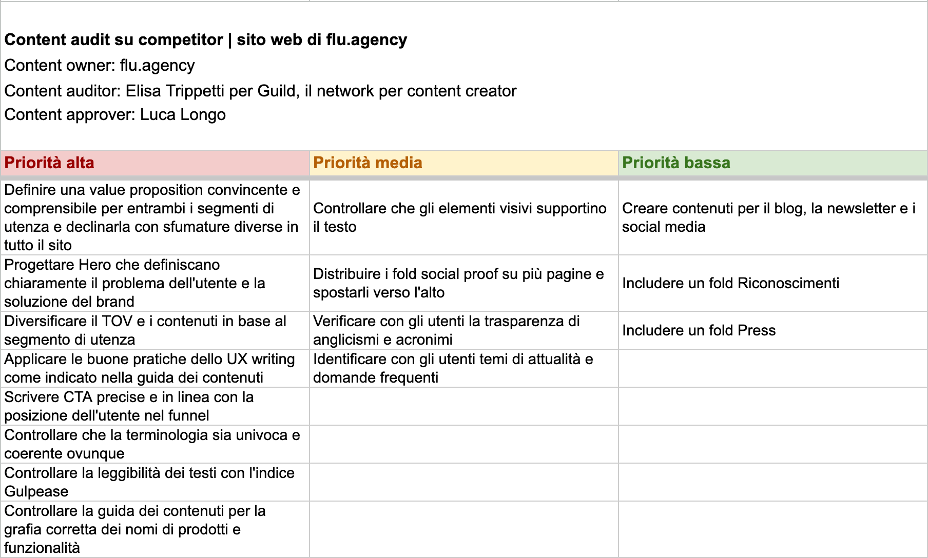
I identified 6 potential competitors on the Italian scene and picked one for a more in-depth website content audit.
This exercise gave me insight into where other players are doing well and where there’s room to improve the experience.
Opportunities for improvement:
- clear value proposition
- well-defined tone of voice
- inclusive UX writing practices
- clear calls to action
- consistent terminology
- better readability
Content guidelines
Guild can use its content to address some of the needs and pain points uncovered in the previous steps.
I used Kapferer’s Brand Identity Prism to nail down Guild’s values, culture and relationship with its audience.

I then narrowed down a list of 4 key adjectives that capture the brand’s personality: friendly, determined, curious and ambitious — just like the creators Guild wants to attract.
In a voice chart, I described how writers at Guild can embody these traits and included several copy dos and don’ts.

To make the copy consistent and accessible, I drafted UX writing best practices and a set of style guidelines.
Each recommendation is accompanied by practical examples of what to write and not to write in different contexts.


The (micro)copy
After creating this framework, I wrote a set of sample pieces of content (including UI components, webpages, emails and social media posts).
A tone map shows where each piece of content is on the tone spectrum (from formal to informal, and concise to detailed).


The result
A complete set of content guidelines covering what every new writer on the client’s team needs to know: user research, brand personality, tone of voice, style and plenty of examples to bring the product’s content to life.
Use content guidelines as a starting point to scale your voice while staying consistent and recognizable!

Read more from me:


